The 2026 Colours of the Year Are Here: Do They Actually Work for Selling Your Waterloo Region Home?
- Team Pinto

- Jan 29
- 12 min read
Every January, the paint industry makes its annual proclamations. Sherwin-Williams, Benjamin Moore, Valspar, and Pantone each unveil their carefully chosen "Colour of the Year"—the shade they predict will dominate design conversations for the next twelve months.
For 2026, something interesting happened. While these companies rarely agree on specific hues, they aligned on a broader philosophy: grounding, warmth, and connection to nature.
Sherwin-Williams chose Universal Khaki, a versatile tan. Valspar selected Warm Eucalyptus, a restorative green. Benjamin Moore picked Silhouette, a deep burnt umber-charcoal. Pantone went with Cloud Dancer, an airy, light neutral.
As Waterloo Region real estate agents who've sold hundreds of homes, we watch these colour announcements with professional interest. Not because we're interior designers following trends, but because we need to answer a practical question our seller clients ask constantly: "What colours should I paint before listing?"
So here's the real question behind the hype: Do these 2026 colours actually work for selling homes? Or are they design-world darlings that look great in magazines but tank your sale prospects?
The answer is more nuanced than you might expect.
What the Paint Companies Are Telling Us (And Why It Matters)
Before we evaluate these colours from a real estate perspective, it's worth understanding what the paint industry is actually saying with these choices.
Sherwin-Williams: Universal Khaki (SW 6150)
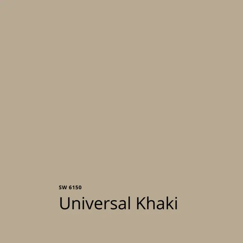
This is a warm, versatile tan that Sherwin-Williams describes as grounding and adaptable. It's not beige (which has been paint-world poison for years), and it's not gray (which dominated the 2010s to exhaustion). It's somewhere in between—a neutral that reads warm rather than cool, earthy rather than clinical.
The "universal" in the name matters. Sherwin-Williams is explicitly positioning this as a colour that works across contexts, styles, and spaces. That versatility is exactly what real estate staging requires.
Valspar: Warm Eucalyptus

A soft, muted green with gray undertones. Valspar describes it as restorative and calming—qualities that matter in residential spaces where people need to relax and recharge.
Green has been creeping into mainstream residential design for several years, moving from accent walls to whole-room applications. Warm Eucalyptus represents the mature evolution of that trend: sophisticated enough for adults, subtle enough to work as a neutral.
Benjamin Moore: Silhouette (2118-30)

Here's where things get interesting. Silhouette is a deep, rich colour—burnt umber meets charcoal. This isn't a safe neutral. It's a statement.
Benjamin Moore is betting that after years of light, bright, and airy spaces, designers and homeowners are ready for depth, drama, and coziness. Silhouette is about creating intimate, enveloping spaces rather than open, gallery-like ones.
Pantone: Cloud Dancer (11-4201)

The outlier in apparent direction but not in philosophy. Cloud Dancer is an extremely light, airy neutral—almost white but with the slightest warmth that prevents it from reading stark or cold.
Pantone describes it as peaceful and optimistic. In practical terms, it's the kind of colour that makes spaces feel larger, lighter, and more open without the harshness of pure white.
The Staging Reality Check
Here's what matters for Waterloo Region sellers: paint trends and staging strategy don't always align.
Design trends are about personal expression, current aesthetics, and creating spaces that reflect the homeowner's lifestyle and taste. Staging is about creating mass appeal, maximizing perceived space and light, and removing obstacles to buyer imagination.
These aren't the same goals.
When you're living in your home, paint a feature wall Silhouette if it makes you happy. Choose Warm Eucalyptus for your bedroom because you love how it makes you feel. Express yourself.
When you're selling your home, personal expression takes a back seat to strategic presentation. The question isn't "What colour do I love?" It's "What colour helps the maximum number of buyers envision themselves living here?"
So let's evaluate each 2026 colour through that lens.
Universal Khaki: The Staging All-Star
Of the four 2026 colours, Universal Khaki comes closest to staging gold.
Why It Works for Selling
Warmth without controversy. After years of cool grays dominating, buyers are tired of spaces that feel cold or clinical. But swing too far toward yellow-beige and you trigger "dated" associations. Universal Khaki hits the sweet spot—warm and inviting without reading trendy or polarizing.
Versatility across lighting conditions. Waterloo Region homes face different directions, have varying window configurations, and receive different quality of natural light. Universal Khaki adapts. It doesn't turn green in north-facing rooms or orange in south-facing ones. This consistency across spaces matters when buyers are moving through your home.
Works with existing features. Mnay Waterloo Region homes have honey oak, maple, or darker wood trim and floors. Universal Khaki complements warm wood tones without clashing. It also works with the granite countertops, tile selections, and fixture finishes common in homes from the 1990s-2010s that dominate our resale market.
Appeals to broad demographics. Young professionals don't find it boring. Growing families don't find it impractical. Downsizers don't find it trendy. Empty nesters don't find it youthful. This broad appeal is exactly what staging requires.
Where to Use It When Staging
Universal Khaki works beautifully in main living areas—living rooms, dining rooms, and family rooms where you want warmth and welcome without distraction. It's an excellent choice for kitchens where you're working with existing cabinetry and don't want paint colour fighting with wood tones.
It also works in primary bedrooms where you want calm and comfort but not the starkness of white or the coldness of gray.
Where It Might Not Work
Small, dark rooms without much natural light can look muddy in Universal Khaki. Spaces that desperately need to feel larger and brighter might be better served by lighter neutrals.
Rooms with cool-toned tile, fixtures, or countertops (think gray subway tile, chrome fixtures, white quartz) might clash with Universal Khaki's warmth. In those spaces, cooler neutrals create better cohesion.
Warm Eucalyptus: Proceed with Caution
Warm Eucalyptus represents the sophisticated evolution of green in residential spaces. But sophistication and staging strategy don't always align.
The Challenge with Green
Here's the staging reality about green: it's polarizing. Some buyers love it. Others hate it. When you're trying to appeal to the broadest possible buyer pool, polarizing colours create risk.
Green also has association baggage. Buyers might see it and think "trendy" (which triggers concerns about dating quickly) or "bold choice" (which reminds them they'll need to repaint). Either reaction creates friction in their mental move-in process.
When It Might Actually Work
That said, Warm Eucalyptus is about as safe as green gets. The gray undertones soften it significantly. The muted quality prevents it from reading loud or demanding.
In specific applications, it could work:
Powder rooms or half baths where a touch of personality doesn't hurt and the small space means repainting isn't a major investment for buyers who disagree with your choice.
Home offices or dens in homes where these spaces are clearly defined as separate from main living areas. Buyers expect a bit more personality in these rooms and are more forgiving of colour choices.
Accent walls in primary bedrooms (and only if the rest of the room is neutral) where it creates a focal point without overwhelming the space.
Where to Avoid It
Do not paint main living areas Warm Eucalyptus when staging. Don't use it in kitchens. Don't paint all four walls of bedrooms this colour. The risk of buyer resistance outweighs any potential benefit.
If your home already has green walls and you're debating whether to repaint before listing, the answer usually depends on intensity and application. Soft, subtle greens similar to Warm Eucalyptus might survive if they're well-executed. Brighter, more saturated greens should go.
Silhouette: Beautiful But Risky for Staging
Let's be direct: deep, dramatic colours are a tough sell in real estate staging.
Why Dark Colours Create Challenges
Space perception. Dark colours make rooms feel smaller. When square footage is a selling point (and it almost always is), making spaces feel smaller works against your interests.
Light absorption. Dark walls absorb light rather than reflecting it. This makes rooms feel darker and less open—the opposite of what most staging strategies aim to achieve.
Strong personal statement. Silhouette is gorgeous. It's also unmistakably a choice. When buyers see it, they're immediately aware that someone chose this deliberately. That awareness can interrupt the emotional connection you're trying to create. Instead of imagining their furniture and their life in the space, they're thinking about how they'd change it.
The Very Limited Staging Applications
Are there scenarios where Silhouette or similar deep colours work when selling? Extremely limited ones:
High-end, architecturally significant homes where buyers expect sophisticated design choices and have budgets for immediate customization if they disagree with your choices.
Specific architectural features like a library or study in a larger home where the drama enhances the space's purpose rather than fighting it.
Feature walls in very large rooms with excellent natural light, where the dark wall creates depth and interest without making the space feel small or dark.
For the vast majority of Waterloo Region homes—your typical 3-4 bedroom family home, townhouse, or condo—Silhouette is a staging mistake. Save it for after you buy your next home.
Cloud Dancer: The Safer Staging Bet
Cloud Dancer represents Pantone's lighter, airier counterpoint to the earthy, grounding choices from paint companies. From a staging perspective, it's the safest bet of the four.
Why Light Neutrals Remain Staging Classics
Maximizes perceived space. Light colours reflect light and make rooms feel larger. When you're trying to showcase square footage, this matters enormously.
Creates blank canvas for buyers. The lighter and more neutral your walls, the easier buyers can imagine their furniture, their art, and their lives in your space. You're removing obstacles to their mental move-in process.
Photographs beautifully. Online listings make or break buyer interest. Light, bright rooms photograph significantly better than dark ones. Your listing photos will look more appealing with Cloud Dancer walls than with darker alternatives.
Works across all room types and sizes. Unlike darker or more saturated colours that have specific applications and limitations, light neutrals work everywhere. This simplifies your staging paint strategy.
The Warmth Advantage
What makes Cloud Dancer superior to stark white or cool grays is the subtle warmth. It avoids the sterile, cold feeling that pure white or cool grays can create while still delivering the space-enhancing, light-reflecting benefits of very light colours.
This warmth matters in Waterloo Region particularly. Our winters are long and gray. Homes that feel warm and welcoming have psychological advantages over those that feel cold or institutional.
Where to Use Cloud Dancer When Staging
Essentially everywhere. Small bedrooms that need to feel larger. Dark hallways that need brightening. Basements with limited natural light. Main living areas where you want maximum appeal.
The only spaces where you might choose something different are rooms with specific architectural features you're trying to highlight or scenarios where slightly warmer or deeper neutrals create better cohesion with existing fixed elements like flooring or cabinetry.
The Bigger Staging Colour Strategy
Here's what years of selling Waterloo Region homes has taught us about paint and staging:
Neutrals Win, But Warm Neutrals Win More Right Now
The 2026 colour choices confirm what we're seeing in the market: buyers are moving away from cool grays and toward warmer neutrals. This doesn't mean beige is back (it's not). It means the sweet spot is warm without being yellow, neutral without being cold.
If you're repainting before listing and trying to choose between similar shades, lean slightly warm rather than cool. Your home will feel more inviting, and that emotional response drives buying decisions.
Consistency Matters More Than Specific Colour Choice
One of the biggest staging mistakes we see is homes with different neutral colours in every room. The living room is one shade, the kitchen is another, bedrooms are all different neutrals. This creates visual chaos and makes homes feel choppy rather than flowing.
Choose one neutral for main living areas and bedrooms. Use it consistently. This creates cohesion and makes your home feel larger and more thoughtfully maintained.
You can vary in bathrooms, powder rooms, or clearly defined spaces like home offices, but your main spaces should share a colour story.
Existing Elements Drive Colour Choices
Your floors, trim, cabinetry, countertops, and tile aren't changing before you sell. Your wall colour needs to work with these fixed elements.
If you have warm honey oak floors and maple cabinetry (common in 1990s-2000s Waterloo Region homes), Universal Khaki or Cloud Dancer works beautifully. Cool grays might clash.
If you have gray tile, white quartz counters, and contemporary cool-toned finishes, slightly cooler neutrals might create better cohesion.
The 2026 colours trend warm, which aligns well with the wood tones in most Waterloo Region resale homes. But always test paint in your specific space with your specific existing elements before committing to full rooms.
When in Doubt, Go Lighter and More Neutral
If you're debating between two options and genuinely can't decide, choose the lighter, more neutral one. You'll rarely regret making a space brighter and more neutral when staging. You might regret choosing something darker or more saturated if it limits your buyer pool.
Practical Application for Waterloo Region Sellers
So what does this mean if you're actually preparing to list your Waterloo Region home in 2026?
If You're Repainting from Scratch
Primary choice: Cloud Dancer or Universal Khaki for all main living areas, depending on your existing fixed elements. Cloud Dancer if you have cooler-toned or mixed elements and want maximum light. Universal Khaki if you have warm wood tones and want inviting warmth.
Secondary choice: Keep existing neutral walls if they're already in a warm or light neutral family and are in good condition. Sometimes a thorough cleaning is enough, and you can allocate your budget to more impactful staging improvements.
Avoid: Warm Eucalyptus and Silhouette in main rooms when staging. Save experimentation for your next home.
If You're Evaluating Existing Colours
Keep existing colours if: They're already neutral, in good condition (no scuffs, marks, or wear), and don't fight with your fixed elements. Not every home needs repainting before listing.
Repaint if: Your current colours are bold, saturated, or dark. If you have feature walls in strong colours, return them to neutral. If different rooms are painted drastically different colours, create consistency.
Spot-treat if: Most rooms are fine but specific walls or areas show damage or wear. Sometimes strategic repainting of problem areas is enough.
What These 2026 Colours Tell Us About Where Staging Is Heading
The broader message from paint companies this year aligns with what we're seeing in successful staging: buyers want spaces that feel grounding, warm, and connected to natural elements without being dark, cold, or sterile.
The pandemic fundamentally changed how people relate to their homes. Spaces that feel restorative, calming, and nurturing matter more than spaces that feel like showrooms. This shift shows up in colour preferences—away from stark, cool, gallery-like neutrals and toward warmer, more human-scale tones.
For staging purposes, this means the stark white walls and cool grays that dominated staging advice for years are losing effectiveness. Not because they're wrong, but because they're no longer what most buyers unconsciously prefer.
Warm, light neutrals like Cloud Dancer deliver the practical staging benefits (space enhancement, broad appeal, blank canvas) while also creating the emotional warmth buyers increasingly value.
Universal Khaki takes this further, offering genuine warmth and richness while maintaining neutral versatility.
These aren't just 2026 trends. They represent a longer-term shift in residential colour preferences that smart sellers should understand.
The Bottom Line for Waterloo Region Sellers
The 2026 colours of the year aren't a staging prescription. They're data points that confirm what we're already seeing in the market: warm neutrals are replacing cool ones, and buyers want spaces that feel grounding and welcoming.
Should you paint your entire home Universal Khaki before listing? Not necessarily. Should you consider whether your current wall colours align with this broader shift toward warmth and natural tones? Absolutely.
The best staging colour strategy isn't about following design trends. It's about understanding your specific home, your existing fixed elements, your target buyer pool, and current market preferences—then making strategic choices that maximize appeal while minimizing buyer resistance.
Sometimes that means repainting in trending colours like Universal Khaki or Cloud Dancer. Sometimes it means keeping your existing neutral walls and investing your budget elsewhere. Sometimes it means targeted repainting of specific rooms or walls that are actively problematic.
What it never means is painting feature walls Silhouette in your living room or choosing Warm Eucalyptus for your kitchen just because paint companies declared them important. Beautiful in a magazine spread and effective for selling your home are different standards.
Getting Staging Right for Your Specific Home
Paint colour is one element of effective staging. It matters, but it exists within a larger strategy that includes decluttering, depersonalizing, repairs, updates, furniture arrangement, lighting, and dozens of other factors that collectively determine how buyers respond to your home.
The challenge for most sellers is knowing which improvements matter for their specific home in current market conditions and which are wasted effort or money.
This is where working with experienced local real estate agents makes the difference. We've sold hundreds of Waterloo Region homes across all price points, property types, and market conditions. We know what works, what doesn't, and what's worth your investment.
We can walk through your home and provide specific guidance: these walls need repainting in this colour, these walls are fine, this budget is better spent on these improvements instead.
We understand how your home compares to current competition, what buyers in your price range prioritize, and how to position your property for maximum appeal and value.
Paint trends are interesting. Market results are what matter.
Ready to Prepare Your Home for Sales Success?

If you're planning to list your Waterloo Region home in 2026, let's talk about staging strategy before you buy a single can of paint.
Team Pinto provides comprehensive staging guidance as part of our listing service. We'll assess your home, recommend specific improvements that make sense for your budget and timeline, and help you present your property for maximum market impact.
Whether the 2026 colours work for your specific home or different choices make more sense, we'll provide clear, actionable guidance based on what actually sells homes in your neighbourhood and price range.
Contact Team Pinto today at 519-818-5445 or visit teampinto.com. Let's make sure your selling strategy—including paint colours—positions you for the best possible sale results.


